Packaging QR Codes That Survive the Warehouse (Size, Contrast, and Error Correction)
A practical guide to putting a QR code on packaging that still scans after pallets, shrink wrap, and scuffed corners: module size, quiet zone, contrast, materials, and error correction.
Mike · · · 11 min read · 2,365 words
Why packaging QR codes fail
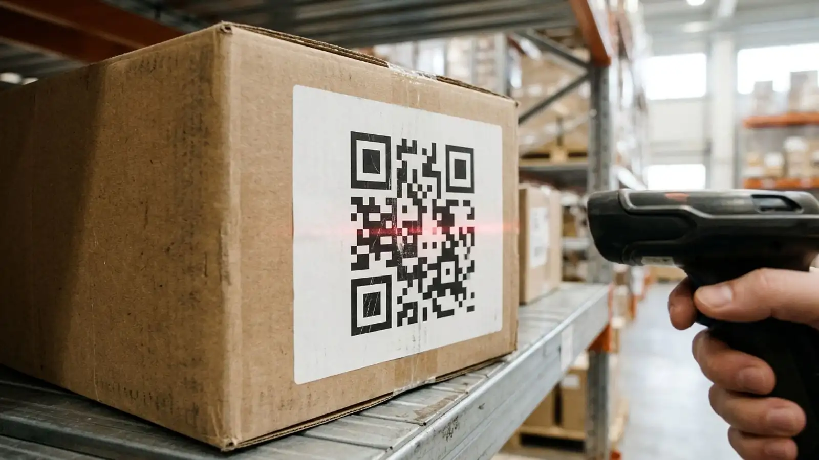
A QR code on packaging scans fine on the proof and on the first unit off the line. It's a different story three weeks later, after the box has been strapped to a pallet, run through a conveyor, wrapped in stretch film, and scanned by a picker who is holding a handheld imager at arm's length.
Most failures come from a small set of causes:
- Modules too small for the print process or the scanning distance
- Quiet zone eaten by a die line, a seam, a barcode, or a decorative border
- Low contrast, especially with the wrong ink color for the scanner's illumination
- Surface problems such as glare, curvature, wrinkles, or ink spreading on corrugate
- Too much data, which forces a denser code with smaller modules
- Physical damage that goes beyond what the error correction level can recover
This guide goes through each one and finishes with a pre-press checklist you can give to your packaging or print vendor.
Step 1: Decide what the code has to do
Before you pick a size, write down who is scanning it and where.
- Consumers on phones scan at roughly 15–40 cm, usually in good light, and usually from a shelf or a kitchen counter.
- Warehouse and receiving staff may use dedicated 2D imagers, fixed-mount scanners over conveyors, or phones. The distance can be anywhere from a few centimeters to a couple of meters.
- Both. Many brands now want one code that serves consumers and supply-chain systems. As of 2026, GS1's push toward 2D barcodes at retail point of sale (often called "Sunrise 2027") and the GS1 Digital Link standard are the main reasons for this. If you're going that way, confirm the exact data format with your GS1 member organization and retail partners. Don't improvise it.
The answer sets your minimum size, your error correction level, and whether the code should be static or dynamic.
Step 2: Keep the data short
A QR code's density depends on how many characters it encodes. A longer URL needs a higher QR "version," which means more modules packed into the same printed area. Each module is then smaller and harder to read once it's printed.
On packaging that matters for two reasons:
- Smaller modules are less tolerant of ink spread, substrate texture, and blur from motion or distance.
- The print run is permanent. You can't shorten a URL after 50,000 cartons are printed.
Practical rules:
- Avoid encoding long campaign URLs with UTM strings directly in a static code.
- Use a short dynamic link when you can. The printed code stays small and low-density, and you can change the destination later (product recall page, new manual version, regional landing page) without reprinting.
- Use uppercase alphanumeric data where your format allows it. QR's alphanumeric mode is more compact than byte mode. Check that your URL scheme and server handle uppercase paths correctly first.
For SKU-level codes, every product gets its own short link. That's a bulk generation job, covered in Step 8.
Step 3: Size the code for distance and process
The distance rule of thumb
A common heuristic for phone scanning is a distance-to-code-width ratio of roughly 10:1. A code expected to be scanned from 30 cm should be about 3 cm wide. Treat that as a starting point, not a guarantee. Camera quality, lighting, code density, and scanner optics all shift it.
Dedicated 2D imagers vary a lot. Some long-range models read large codes from several meters away, while standard-range handhelds are optimized for close work. Check the reading-range table in your scanner's datasheet. Those tables are usually expressed in module size (X-dimension), not overall code size.
Think in module size, not code size
Specify the module size (the width of one black or white square) as well as the overall dimensions. Two codes printed at 25 mm can behave very differently if one encodes 20 characters and the other encodes 120.
Typical starting points (validate with your printer and scanners):
| Situation | Suggested starting module size | Notes |
|---|---|---|
| Consumer packaging, offset or digital print, phone scan | ~0.33 mm or larger | Many guides cite this as a comfortable minimum for phones |
| Labels on thermal transfer printers | Match to printer dot pitch (e.g. whole multiples of dots) | Avoid fractional dots; they cause uneven module widths |
| Flexo on corrugated cartons | Noticeably larger; ask the converter | Fluting, ink spread, and plate distortion all reduce effective quality |
| Warehouse scanning at 1 m+ | Driven by scanner datasheet | Often needs a much larger dedicated code |
On thermal label printers in particular, make each module a whole number of printer dots. At 203 dpi, one dot is about 0.125 mm. A module that falls between dots gets rounded inconsistently and comes out jagged.
Don't forget the quiet zone
The QR specification (ISO/IEC 18004) calls for a quiet zone of 4 modules on all sides: a clear margin with no text, lines, or graphics. Some readers cope with less, but packaging is the worst place to gamble on that.
Common ways the quiet zone gets lost on packaging:
- Placing the code tight against a fold, seam, or die cut
- Putting it next to a linear barcode or a nutrition panel border
- Adding a decorative frame that touches the code
- Automatic "fit to box" scaling in the artwork file that crops the margin
Mark the quiet zone as a keep-out area in your dieline so prepress doesn't fill it.
Step 4: Get contrast right for real scanners
Dark on light, with real contrast
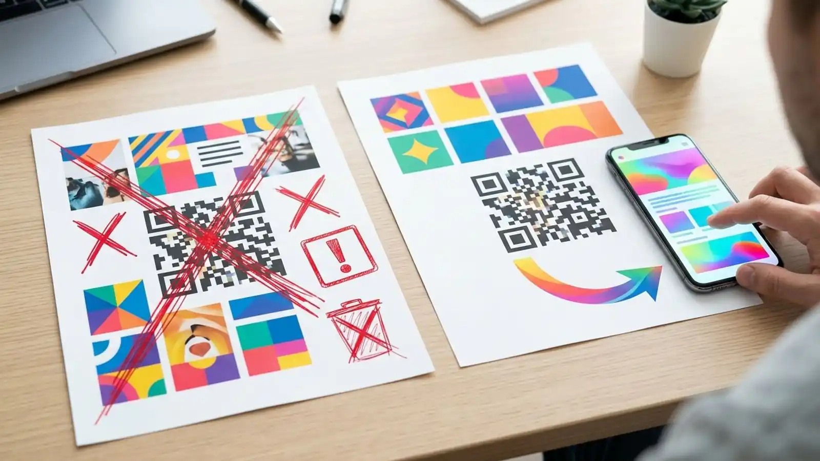
Dark modules on a light background is still the safest choice. Inverted codes (light on dark) are supported by many modern phone readers, but plenty of older apps and some industrial scanners still handle them poorly. If you need both consumer and warehouse scanning, don't invert.
Watch out for red
Many handheld and fixed-mount barcode scanners light the code with red LEDs. Under red light, red, orange, and some warm-toned inks reflect almost like white, so the code's contrast can disappear. A brand-red QR code may scan perfectly on a phone and fail on the receiving dock.
Safer choices:
- Black, dark blue, dark green, or dark brown modules
- White, cream, or light kraft-friendly backgrounds, tested on press
- If brand colors are mandatory, check them under your actual scanner's illumination, not just on screen
Kraft and brown corrugate
Unbleached kraft gives you less contrast than white board. Options:
- Print a white underlay or panel behind the code
- Use a printed or applied white label for the code area
- Go larger on module size to compensate for the rough surface
Step 5: Account for material and surface
The substrate often matters as much as the artwork.
Gloss, film, and shrink wrap
- Glare. Glossy laminates and varnishes create specular reflections that wash out part of the code at certain angles. A matte varnish over the code area helps.
- Overwrap. Stretch film and shrink sleeves add their own glare and wrinkles. If cartons get wrapped on pallets, plan for a scannable label outside the wrap or on the pallet itself.
- Shrink sleeves distort artwork as they shrink. Put the code where distortion is lowest and ask your converter about pre-distortion.
Curved surfaces
On bottles, cans, and tubes, a code that wraps too far around the curve gets foreshortened at the edges. Keep the code small relative to the container's diameter, or orient it so the code's height runs along the straight axis. Test on the physical container, not a flat proof.
Corrugate and flexo
- Flutes under the print surface cause uneven ink laydown, sometimes called "washboarding."
- Ink spread makes dark modules grow. Your converter may apply print gain compensation (slightly shrinking dark modules in the artwork) to offset it.
- Avoid placing codes across a score line or flap edge.
Direct thermal vs. thermal transfer labels
Direct thermal labels are cheap and common in logistics, but they can darken or fade with heat, sunlight, and time. If the code must last for months, such as returns, warranty, or long storage, thermal transfer or a protected label stock is usually the more durable choice.
Step 6: Choose the error correction level
QR codes use Reed–Solomon error correction at four levels. Each level can recover roughly this share of damaged codewords:
| Level | Approx. recovery | Trade-off |
|---|---|---|
| L | ~7% | Smallest, least dense code; minimal damage tolerance |
| M | ~15% | Common default; balanced |
| Q | ~25% | Denser; good for rough handling |
| H | ~30% | Densest; most damage tolerance; often used with center logos |
These percentages refer to the approximate share of damaged codewords the decoder can recover. They don't translate to the same percentage of the code's printed area. Depending on where damage falls, a small scuff can affect several codewords, and some areas of the symbol (like the finder patterns) aren't protected by error correction at all.
Higher error correction isn't free. A higher level may require a larger QR version, depending on the data and version selected. When it does, the code has more modules, so at a fixed print size each module gets smaller. Sometimes that hurts readability more than it helps.
Practical guidance
- Clean retail packaging, short dynamic link, no logo: M is usually fine.
- Shipping cartons, scuff-prone surfaces, conveyor contact: Q is a sensible default.
- Center logo, or codes in high-abrasion spots: H, and increase the printed size if needed so modules don't shrink.
- Very small codes on tiny packs: consider M with shorter data rather than H with smaller modules. Test both.
Error correction recovers scattered damage best. A deep scratch through all three finder patterns (the large corner squares) can make a code unreadable no matter which level you chose. Protect the corners through placement: away from edges, straps, and the spots where cartons rub on conveyor rails.
About logos
If you put a logo in the center, it uses up part of the error correction capacity, leaving less margin for real-world scuffs. The logo's covered area isn't a direct measure of how much capacity it consumes or how much remains, so don't assume a logo covering 10% of the code leaves 20% of H's budget intact. Use H, keep the logo modest, never cover the finder patterns or timing patterns, and test the finished symbol, logo included, on the real substrate before approving it.
Step 7: Test like a warehouse, not like a designer
Phone-scanning a PDF on your monitor tells you almost nothing. Build a small test protocol instead.
- Print on the real substrate with the real process: a press proof or production sample, not an office printer.
- Scan with every device class you expect: a few phone models (older ones included), the stock camera app plus a common scanner app, and the actual warehouse handheld or fixed-mount unit.
- Test the worst conditions: low light, overhead glare, the farthest realistic distance, an angled approach, and through stretch film if that applies.
- Abuse a sample. Rub it, fold the carton, run it through a conveyor if you can, then scan again.
- Grade it if it matters. For supply-chain codes, a barcode verifier grading to ISO/IEC 15415 gives you an objective print-quality score your partners may require. Phone tests can't replace that.
- Check the destination. Confirm every code resolves to the correct page, loads fast on mobile data, and doesn't hit a dead link.
Step 8: Scale to SKUs without spreadsheets breaking
Once one code works, the next problem is often 400 SKUs × 3 regions.
- Generate in bulk from a CSV with one row per SKU (SKU, destination URL, label text) so artwork files and codes stay in sync.
- Use dynamic codes so a product page change, recall notice, or region switch doesn't mean reprinting.
- Name codes by SKU and keep an export of code IDs mapped to SKUs for your packaging team and your PIM or ERP.
- Watch scan analytics by SKU to catch problems early. A code that suddenly gets zero scans after a print run change is worth investigating.
For platforms that generate codes for many brands (packaging printers, label software vendors), a white-label setup can let you offer this under your own brand. See white label options.
Pre-press checklist
Hand this to your designer and print vendor before plates are made:
- [ ] Encoded data is as short as practical (short dynamic link preferred)
- [ ] Module size specified and approved by the printer for this substrate
- [ ] Module size is a whole multiple of printer dots (thermal labels)
- [ ] Code size fits the farthest expected scanning distance
- [ ] 4-module quiet zone marked as keep-out on the dieline
- [ ] Dark modules on a light background; not inverted
- [ ] Ink color verified under red-LED scanner illumination
- [ ] White panel or label used on kraft or dark substrates
- [ ] Matte finish over the code area if the pack is glossy
- [ ] Not placed across folds, scores, seams, or tight curves
- [ ] Error correction chosen (M / Q / H) with size adjusted for density
- [ ] Logo (if any) is small, centered, uses level H, and the finished symbol has been scan-tested
- [ ] Tested on a production sample with phones and warehouse scanners
- [ ] Verifier grade recorded if supply-chain partners require it
- [ ] Every destination URL checked live on mobile
<!-- EDITOR: Before publication, verify against the current pricing page that (1) the Max QR generator is free with no account required, and (2) the Business plan includes bulk CSV generation, custom domains, and the developer API. -->
Try it on Max QR
You can generate static test codes for free in PNG or SVG, with no account required, on the Max QR generator. Vector SVG is the format to send to prepress.
For production packaging, the dashboard gives you dynamic short links, editable destinations, and scan analytics. When you're labeling a full catalog, the Business plan adds bulk CSV generation, custom domains, and the developer API for SKU-level codes. Compare plans on the pricing page, or read the docs for CSV and API details.
Try it on your campaign
Design a QR code in the browser — the same workflow we write about.