Your QR Won’t Scan. These 12 Mistakes Are Why (Fix Them Before Print)
QR code not scanning? Here are 12 common design and print mistakes, from weak contrast and missing quiet zones to oversized logos and glossy finishes, and how to fix each before you print.
Mike · · · 10 min read · 2,001 words
Why most scan failures start at the design stage
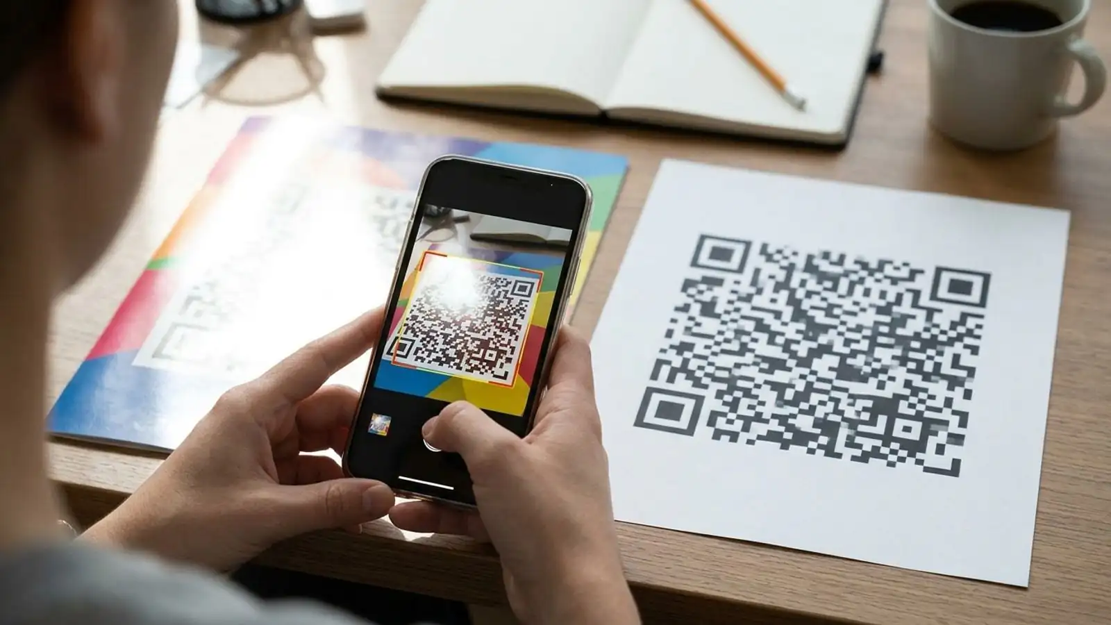
When a QR code won't scan, people usually blame the phone. Most of the time, though, the problem was locked in before the file went to print. The code had too little contrast, it was too small for the viewing distance, the logo covered too much, or a glossy finish turned it into a mirror.
The good news is that you can predict almost every failure. QR codes follow a published standard (ISO/IEC 18004), and scanners all do roughly the same things: find the three corner squares, measure the grid, and decode the dark and light modules. If anything gets in the way of those steps, scans slow down or fail.
Below are the 12 mistakes we see most often, what causes each one, and how to fix it. A pre-print checklist follows at the end.
1. Low contrast between modules and background
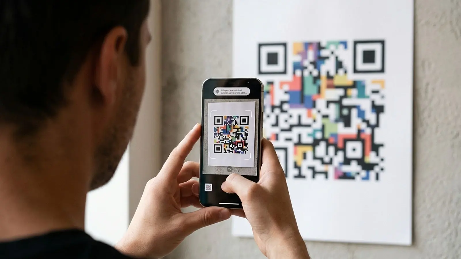
Scanners primarily need strong light/dark contrast; don't rely on hue alone. Two colors that look clearly different to you can have almost the same brightness to a camera sensor. Some classic failures:
- Yellow, light orange, or pastel modules on white
- Mid-gray on light gray
- Brand red on dark navy, which looks bold but sits close in brightness
Fix:
- Keep the modules dark and the background light. Black or a deep brand color on white or off-white is the safest choice.
- Check your colors in grayscale. If the code turns muddy when you remove saturation, it will be unreliable in print.
- Remember that print usually loses contrast compared with your screen, especially on uncoated or recycled stock.
2. Inverted colors (light code on dark background)
Light-on-dark codes look sleek on dark packaging. Many recent phone camera apps can read them, but support is not universal, especially in older devices, some third-party scanner apps, and point-of-sale or kiosk scanners.
Fix: Use the standard dark-on-light layout unless you control the scanning hardware or have tested on a wide range of devices. If the design has to be dark, put the code on a light panel with its own quiet zone.
3. Printing it too small for the scanning distance
Size depends on how far away people will be when they scan. A common rule of thumb is a distance-to-width ratio of about 10:1. A code scanned from 1 meter should be roughly 10 cm wide. Treat this as a starting point, not a guarantee, because lighting, camera quality, and code density all shift the number.
As a practical floor for close-range print like business cards and labels, many printers and designers work with about 2 cm (0.8 in) as a minimum width, and larger whenever the code contains a lot of data.
Fix:
- Work out the real scanning distance first: hand-held, across a table, on a wall, or on a billboard.
- Size the code from that distance, then add margin for poor lighting.
- Print a test at actual size. Don't judge it from a zoomed-in monitor.
4. Cropping or crowding the quiet zone
The quiet zone is the empty margin around the code. The QR standard specifies four modules of clear space on every side. Scanners use this border to tell where the code ends and the surroundings begin.
Designers often trim it to save space or place the code right against a border, a photo, or text. That is one of the most common reasons a QR code won't scan even though it looks fine.
Fix:
- Keep at least four module-widths of clear, light space on every side.
- Don't let background patterns, gradients, or other graphics run into that margin.
- If the layout is tight, make the whole code smaller rather than cutting into the margin. Then check that it still meets the size requirement from mistake #3.
5. A logo that covers too much (or the wrong parts)
A logo works because of error correction: the code contains redundant data, so a scanner can rebuild modules that are missing. A logo uses up some of that redundancy. If it's too large, there is nothing left to cover real-world damage like scuffs, glare, or a slightly blurry photo.
Logo area alone doesn't determine whether a code will decode. Placement matters just as much, because it decides which codewords and structural elements the logo covers. Never cover:
- The three finder patterns, the large squares in three corners
- The alignment pattern(s), the smaller square near the bottom-right on most codes
- The timing patterns, the alternating lines that connect the finder patterns
Fix:
- Center the logo and keep it modest. There is no logo size that is guaranteed to be safe, so the smaller it is, the more margin you leave for real-world damage.
- Keep all functional patterns (finder, alignment, timing) completely clear.
- Give the logo a clean light padding so it doesn't blend into nearby modules.
- Raise error correction when you add a logo (see #6), and always test the finished code on several phones.
6. Choosing the wrong error correction level
QR codes support four error correction levels. Each one can recover roughly this share of its codewords. That is not a guaranteed share of damaged area or logo coverage. Actual recovery depends on where the code is damaged and how.
| Level | Approx. recoverable codewords | Typical use |
|---|---|---|
| L | ~7% | Clean, controlled environments with no logo |
| M | ~15% | General-purpose default |
| Q | ~25% | Codes with small logos, moderate wear |
| H | ~30% | Logos, outdoor use, rough handling |
There is a trade-off. Higher levels reserve more space for redundancy, which reduces how much data the code can hold. For the same content, that can force a higher QR version with more modules, though it doesn't always. When it does, the code gets denser and each module gets smaller at the same print size. Choosing H for a long URL on a tiny label can backfire.
Fix: Use M as your baseline, move to Q or H when you add a logo or expect wear, and confirm the printed size still gives you clear, distinct modules.
7. Packing too much data into a static code
A static QR code stores its content directly. A long URL with tracking parameters, a full vCard, or a paragraph of text means more modules, a higher QR "version," and a busier pattern. Dense codes need more print size and better cameras to read reliably.
Fix:
- Shorten what you encode. Remove unneeded URL parameters.
- Use a dynamic QR code, which stores a short redirect link and sends people to the full destination. The pattern stays simple no matter how long the real URL is, and you can change the destination later without reprinting.
8. Glossy, metallic, or reflective finishes
Gloss lamination, UV spot varnish, foil stamping, and metallic inks can all create glare. Under store lighting or a phone's flash, a bright spot can wash out part of the code. The scanner sees a blank area where modules should be.
Clear plastic sleeves, acrylic signholders, and glass display cases cause the same problem.
Fix:
- Use a matte finish behind the code, or knock out the gloss varnish over the code area.
- Don't print QR modules in foil or metallic ink. Use flat, solid ink.
- Test the code under the lighting where it will actually hang, at a few angles.
9. Curved, folded, or textured surfaces
Bottles, cans, cups, and tubes bend the grid. A fold or crease through a flyer breaks it. Rough textures like kraft paper, fabric, or corrugated board can blur module edges.
Fix:
- On curved packaging, keep the code small compared with the curve, or place it on the flattest area.
- Keep codes away from fold lines, perforations, and binding.
- On textured or uncoated stock, slightly enlarge the code to make up for ink spread (dot gain).
10. Exporting a low-resolution raster file
A small PNG scaled up in layout software gets soft, blurry edges. Resampling can blend module edges into gray pixels. The result may look acceptable on screen and print as mush.
Fix:
- Use SVG (or another vector format) for print. Vector modules stay sharp at any size.
- If you must use PNG, export it at the final print size and resolution. Don't enlarge it afterward.
- Turn off image smoothing or anti-aliasing filters that soften edges.
11. Over-styling modules and finder patterns
Rounded dots, connected blobs, and custom eye shapes can look great. But every stylistic change moves the code further from what scanners expect. Very thin dots, large gaps between modules, and finder patterns reshaped beyond recognition all make detection harder.
Busy backgrounds cause similar trouble. Photos, gradients, and patterns behind the code compete with the modules.
Fix:
- Keep styling moderate. Modules should be solid and clearly separated from the background.
- Keep the finder patterns recognizable as square-in-a-square shapes.
- Put the code on a flat, light panel, not straight on top of imagery.
12. Never testing the printed piece, or the destination
Some codes scan fine and still fail, because the link goes to a broken page, a desktop-only site, or an expired campaign. With static codes, changing the URL means reprinting everything.
Fix:
- Test a printed proof, not just the screen version, on at least a few devices: recent and older phones, iOS and Android, and the built-in camera plus a third-party app.
- Test in realistic conditions: arm's length, the intended distance, low light, and an angle.
- Open the destination on mobile data, not office Wi-Fi.
- For anything with a long print run, use a dynamic code so you can fix or update the destination without a reprint, and watch scan analytics to catch problems early.
Pre-print scannability checklist
Run through this before you approve any proof.
| Check | Pass condition | If it fails |
|---|---|---|
| Contrast | Strong light/dark contrast: dark modules on light background; clear in grayscale | Darken modules or lighten background |
| Polarity | Standard dark-on-light (unless tested) | Add a light panel behind the code |
| Size | ~10:1 distance-to-width as a starting point; ~2 cm floor for close range | Enlarge or reduce data density |
| Quiet zone | 4 modules clear on all sides | Shrink code or move nearby elements |
| Logo | Centered, modest, padded; finder/alignment/timing patterns untouched; finished code tested | Reduce logo size or move it |
| Error correction | M default; Q/H with logo or wear | Raise level, then re-check size |
| Data density | Short URL or dynamic redirect | Shorten URL or switch to dynamic |
| Finish | Matte behind code; no foil/metallic modules | Knock out varnish, change finish |
| Surface | Flat area, away from folds and tight curves | Reposition or resize |
| File format | Vector (SVG) or PNG at final size | Re-export, don't upscale |
| Styling | Solid modules, recognizable finder patterns, plain backdrop | Simplify styling |
| Live test | Printed proof scans on several devices; destination loads on mobile | Fix and re-proof |
Quick decision guide: static or dynamic?
- Static works for permanent, short content you will never change: a Wi-Fi login on a staff card, or a fixed URL on a one-off item.
- Dynamic fits packaging, signage, print ads, and anything with a long life. You get a simpler pattern (short link), the ability to edit the destination, and scan data to confirm the code is working in the field.
Try it on Max QR
<!-- EDITOR: Before publication, confirm against current plan terms that (1) static codes are free and need no account, and (2) which plans include dynamic-code editing and scan analytics. Update the wording below to match. -->
You can create a static QR code for free on Max QR without an account. You can set colors, add a logo, and export PNG or SVG for print. If the code is going on packaging or signage that will stay up for months, open the dashboard to make a dynamic code. Check the pricing page to see which plans include editing after printing and scan analytics, or read the docs for export and error-correction settings.
Try it on your campaign
Design a QR code in the browser — the same workflow we write about.